I’m a UX/Product designer focused on creating thoughtful experiences that help people achieve their personal and professional goals.
nicktrunkey@me.com
↗
(206) 396-9743
↗
↗

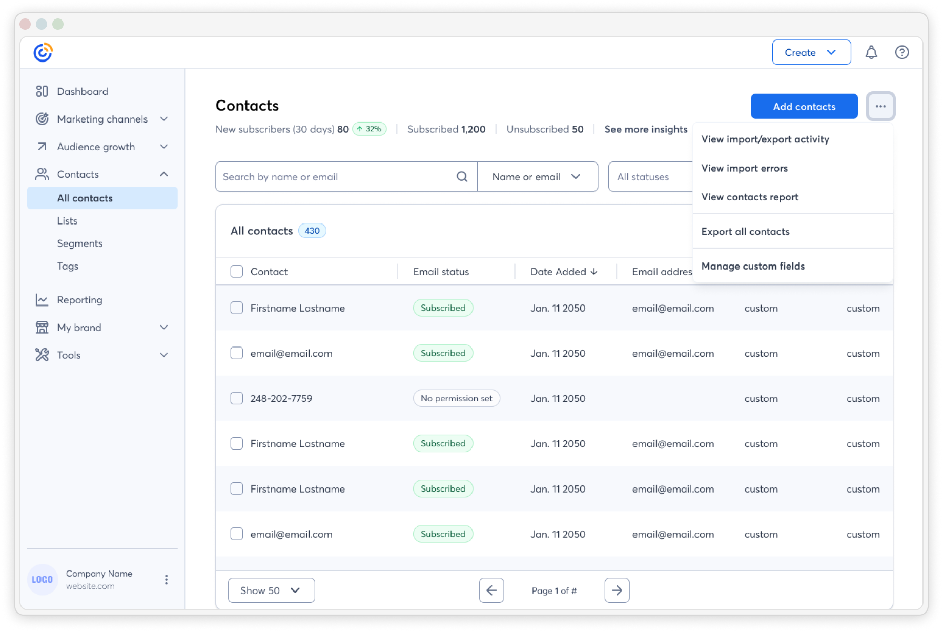
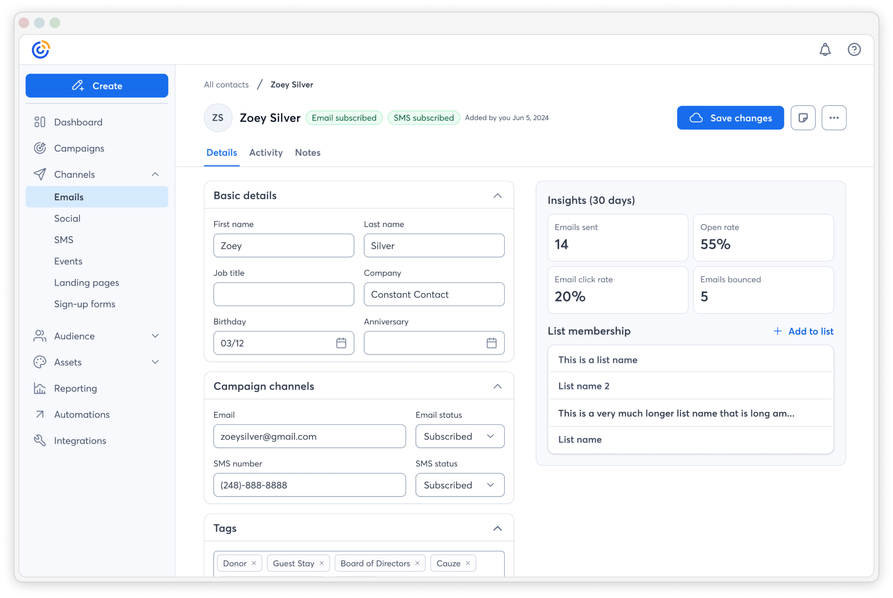
At Constant Contact I helped customers add and manage their contacts quicker and easier than ever before.
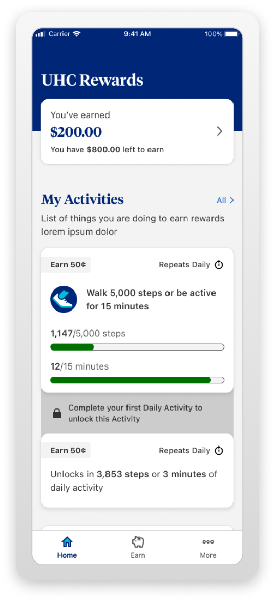
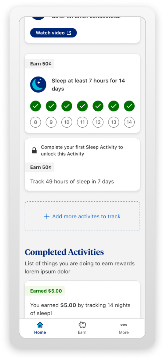
I made it easy for UHC members to stay healthy by rewarding exercising habits.
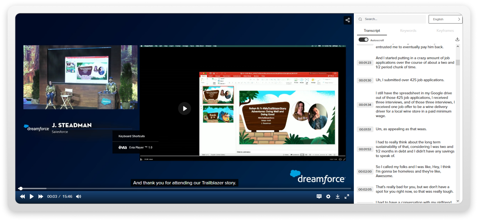
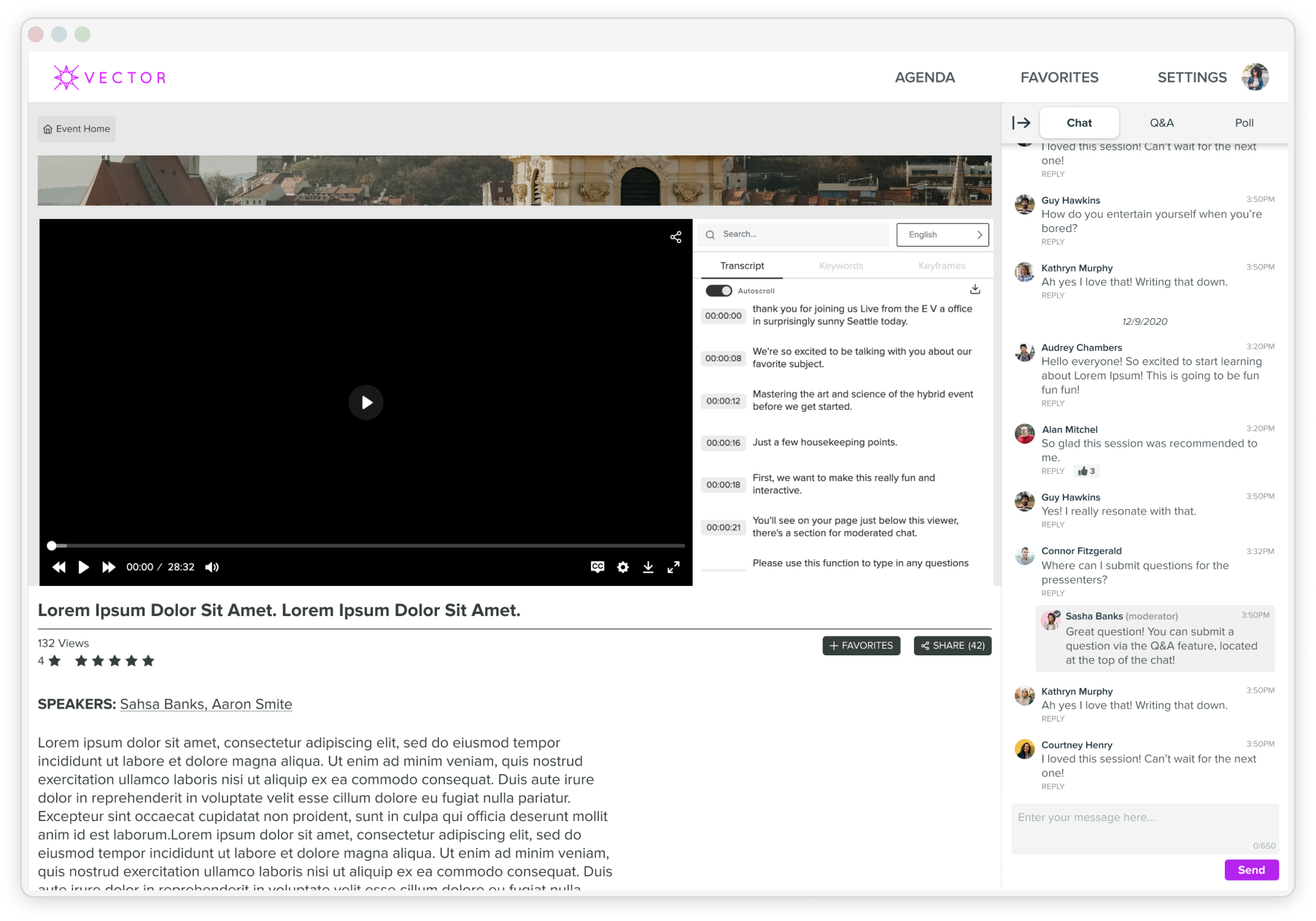
With Evia Events I helped attendees relive their favorite moments from their past conventions and shows.
I accomplished all of this by applying service design principles, thinking holistically about the setting in context to the problem, and using modern tools like Figma, Reforge AI, and Cursor.


nicktrunkey@me.com
↗
(206) 396-9743
↗
↗
I’m a UX/Product designer who crafts thoughtful, accessible digital experiences that balance user needs with business goals. With experience at Constant Contact and Slalom, I’ve designed end-to-end solutions, built design systems, and shipped impactful features that drive growth and retention. I love solving complex problems, collaborating across teams, and turning ideas into intuitive, beautiful products. I take a holistic approach to design, taking the time to understand the bigger picture before crafting solutions that connect every detail with the overall vision.
As a child I loved to build Lego sets. The idea that all the pieces were there but just needed to be put together in the right way excited me. I have always viewed design as a similar puzzle, and truly love the craft and process of placing each bit piece by piece with thoughtfulness and intent. For me, design is not only a profession but a passion as well.
I’m a UX/Product designer focused on creating thoughtful experiences that help people achieve their personal and professional goals.
nicktrunkey@me.com
↗
(206) 396-9743
↗
↗
At Constant Contact I helped customers add and manage their contacts quicker and easier than ever before.
I made it easy for UHC members to stay healthy by rewarding exercising habits.
With Evia Events I helped attendees relive their favorite moments from their past conventions and shows.
I accomplished all of this by applying service design principles, thinking holistically about the setting in context to the problem, and using modern tools like Figma, Reforge AI, and Cursor.


nicktrunkey@me.com
↗
(206) 396-9743
↗
↗
I’m a UX/Product designer who crafts thoughtful, accessible digital experiences that balance user needs with business goals. With experience at Constant Contact and Slalom, I’ve designed end-to-end solutions, built design systems, and shipped impactful features that drive growth and retention. I love solving complex problems, collaborating across teams, and turning ideas into intuitive, beautiful products. I take a holistic approach to design, taking the time to understand the bigger picture before crafting solutions that connect every detail with the overall vision.
As a child I loved to build Lego sets. The idea that all the pieces were there but just needed to be put together in the right way excited me. I have always viewed design as a similar puzzle, and truly love the craft and process of placing each bit piece by piece with thoughtfulness and intent. For me, design is not only a profession but a passion as well.
I’m a UX/Product designer focused on creating thoughtful experiences that help people achieve their personal and professional goals.
nicktrunkey@me.com
↗
(206) 396-9743
↗
↗


At Constant Contact I helped customers add and manage their contacts quicker and easier than ever before.
I made it easy for UHC members to stay healthy by rewarding exercising habits.
With Evia Events I helped attendees relive their favorite moments from their past conventions and shows.
I accomplished all of this by applying service design principles, thinking holistically about the setting in context to the problem, and using modern tools like Figma, Reforge AI, and Cursor.


nicktrunkey@me.com
↗
(206) 396-9743
↗
↗
I’m a UX/Product designer who crafts thoughtful, accessible digital experiences that balance user needs with business goals. With experience at Constant Contact and Slalom, I’ve designed end-to-end solutions, built design systems, and shipped impactful features that drive growth and retention. I love solving complex problems, collaborating across teams, and turning ideas into intuitive, beautiful products. I take a holistic approach to design, taking the time to understand the bigger picture before crafting solutions that connect every detail with the overall vision.
As a child I loved to build Lego sets. The idea that all the pieces were there but just needed to be put together in the right way excited me. I have always viewed design as a similar puzzle, and truly love the craft and process of placing each bit piece by piece with thoughtfulness and intent. For me, design is not only a profession but a passion as well.