Case Study 1: Constant Contact — Contacts Center Redesign & Custom Fields
Role: Lead Designer, Cross-Functional Team
Company: Constant Contact
Deliverables: Contacts Center Redesign, Custom Fields Feature Set
Constant Contact is a digital marketing platform best known for email marketing, helping businesses create, send, and track email campaigns, while also offering tools for social media, event management, SMS, and lead generation.
The Problem
Constant Contact had a contact management experience that hadn't kept pace with how small business owners actually work. Users were churning or failing to activate core features because the contacts center was fragmented — organizing contacts meaningfully required workarounds, and there was no flexible way to structure data around the specific needs of a given business.
This wasn't a cosmetic problem. A yoga studio, a real estate agent, and a catering company all have different ways of thinking about their contacts. The product treated them the same. The result was a contacts center that felt generic to everyone and truly useful to no one.
The challenge: redesign the contacts center from the ground up and introduce a custom fields feature set — without adding complexity for users who didn't need it.

My Role
I led design for this project within a cross-functional team spanning product management, engineering, and data. I owned the end-to-end design process — from initial discovery and problem framing through interaction design, usability testing, and handoff — while working closely with PMs to align on scope and with engineers to pressure-test feasibility throughout.
Discovery & Framing
Discovery & Framing
Early research revealed two distinct failure modes. The first was activation failure: new users couldn't map their existing contact data into the product's rigid structure, so they'd import a list and then disengage. The second was retention failure: power users who outgrew the default fields had no way to extend the system and were either working around it in spreadsheets or leaving for competitors.
Both problems pointed to the same root cause: the data model was inflexible, and the interface reflected that inflexibility rather than hiding it.
The Design Approach
Discovery & Framing
Early research revealed two distinct failure modes. The first was activation failure: new users couldn't map their existing contact data into the product's rigid structure, so they'd import a list and then disengage. The second was retention failure: power users who outgrew the default fields had no way to extend the system and were either working around it in spreadsheets or leaving for competitors.
Both problems pointed to the same root cause: the data model was inflexible, and the interface reflected that inflexibility rather than hiding it.
Trade-off’s & Decisions
Discovery & Framing
Early research revealed two distinct failure modes. The first was activation failure: new users couldn't map their existing contact data into the product's rigid structure, so they'd import a list and then disengage. The second was retention failure: power users who outgrew the default fields had no way to extend the system and were either working around it in spreadsheets or leaving for competitors.
Both problems pointed to the same root cause: the data model was inflexible, and the interface reflected that inflexibility rather than hiding it.
Outcomes
The redesigned contacts center and custom fields feature shipped to Constant Contact's active user base of approximately 600,000 users.
- Adoption rose 3% — roughly 18,000 users engaging with features they previously weren't
- Retention improved 3% independently — a meaningful reduction in churn at this scale
- At Constant Contact's average subscription value, the combined impact influenced an estimated $4M+ in annual recurring revenue
These weren't outcomes tied to a visual refresh. They were tied directly to making contact management more flexible and more intuitive for users who had been working around the product's limitations for years.
What I’d Do Differently
With more time, I'd have pushed harder for a lightweight feedback loop post-launch — a simple in-product prompt to understand which custom fields users were actually creating. That data would have been valuable for prioritizing the templated fields feature in the next phase and would have given us a cleaner story to tell about how the feature was being used in practice.
Case Study 2: UnitedHealthcare — Rewards Program Redesign
Role: Designer, Cross-Functional Team
Company: UnitedHealthcare (UHC)
Deliverables: Redesigned Rewards Experience, shipped to live users
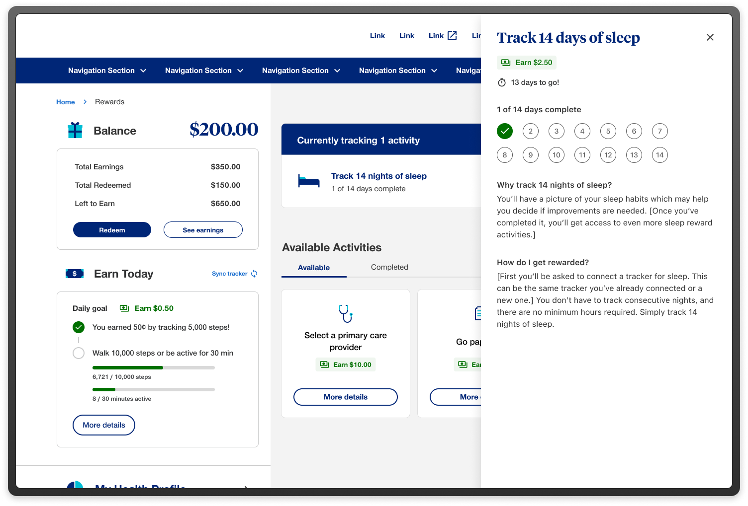
United Healthcare Rewards is a mobile application that allows users to earn points and redeem rewards for engaging in healthy behaviors. The app aims to motivate users to improve their physical and mental well-being, as well as to increase their loyalty to United Healthcare.
The Problem
UnitedHealthcare's rewards program had an engagement problem that looked simple on the surface and wasn't. Members were enrolling, earning points, and then disengaging — a pattern that showed up in the data as low redemption rates and sporadic return visits. The program existed to change member behavior around preventive health actions. If members weren't coming back and redeeming, the program wasn't working — regardless of how many points were technically being issued.
The business goal was clear: increase sustained engagement and redemption rates among members who had historically interacted with the program sporadically. The design challenge was harder to articulate: how do you make a health incentive program feel immediately relevant and personally motivating to people who are, by nature, only thinking about their health intermittently?
Problem statement: How might we design a rewards app for United Healthcare that encourages users to adopt healthy habits, provides them with meaningful incentives, and enhances their satisfaction with United Healthcare?
My Role
I led design within a cross-functional team alongside product management, engineering, and clinical stakeholders. Health rewards programs operate under specific regulatory and clinical constraints that shaped design decisions throughout — understanding those constraints, and working within them without letting them dictate the experience, was a significant part of the job.
The Design Approach
The redesign touched three core areas.
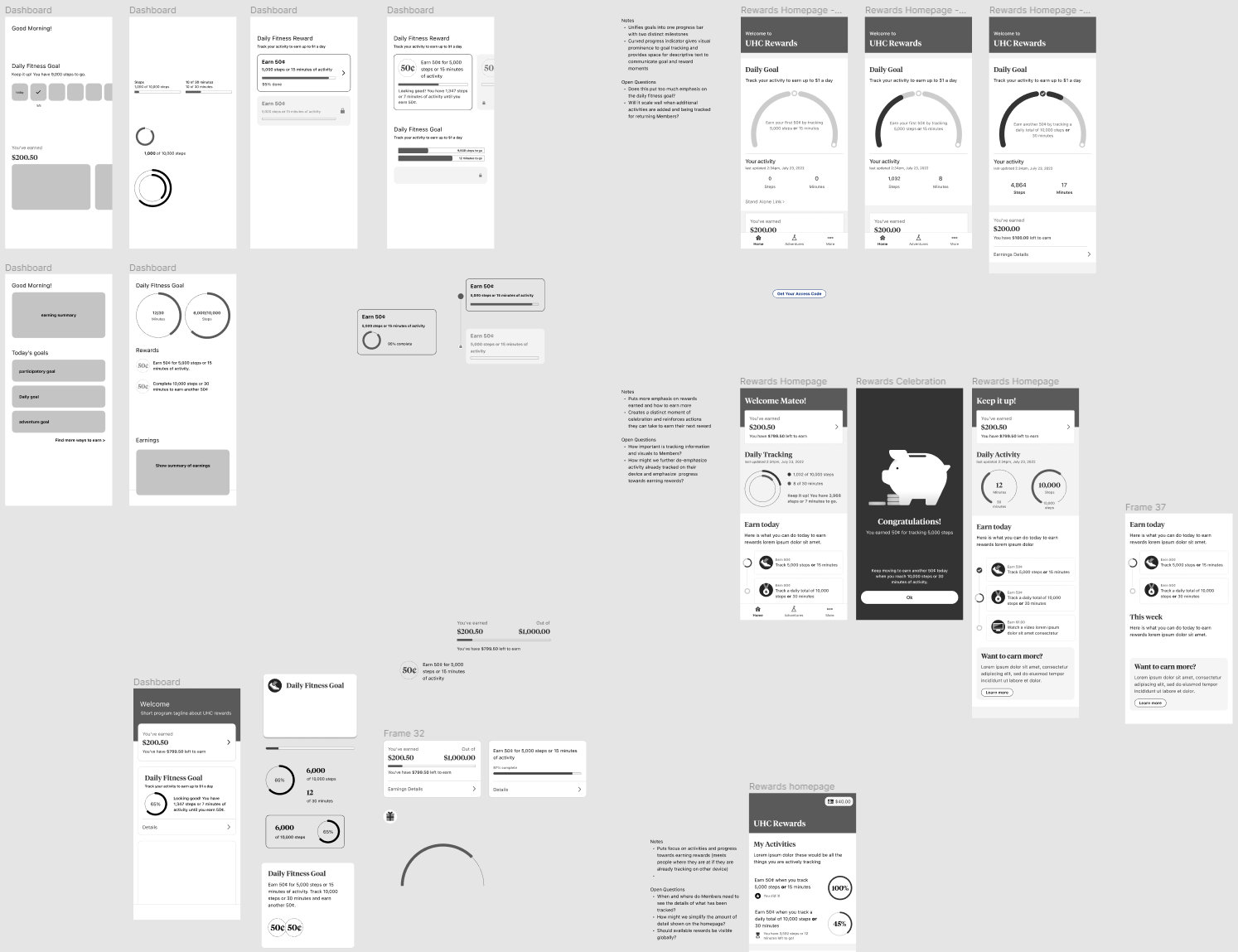
The first was the home experience — the screen members saw when they opened the rewards section. We rebuilt this around the nearest achievable action, not the furthest goal. This sounds like a small change. In terms of interaction design, it required rethinking how we prioritized and sequenced content for members at different stages of engagement.
The second was the redemption flow. Research showed members often didn't know what they could redeem for until they were already deep in the experience. We moved reward options earlier — surfacing them as motivation before members had even earned enough to redeem — so the program felt like it was leading somewhere concrete from the first interaction.
The third was notification and re-engagement. We worked with the product team to align on a notification strategy that was tied to achievable milestones rather than arbitrary time intervals. Members received prompts when they were close to a short-term goal, not just on a weekly cadence.
Trade-off’s & Constraints
Clinical and compliance stakeholders had specific requirements around how health actions could be presented and incentivized. Some of the more direct motivational language we explored in early concepts was flagged as outside clinical guidelines. This was a real constraint, not a bureaucratic one — health incentive programs carry specific regulatory exposure, and the language used to describe health actions matters.
Working within that constraint pushed us toward design solutions that relied more on structure and sequencing than on copy and messaging. In retrospect, that produced a more durable solution — the experience communicated motivation through information architecture rather than marketing language.
Outcomes
The redesign shipped to live users. Targets for the program were set around redemption rate improvement and sustained engagement among previously lapsed members. While I don't have post-launch attribution data to cite directly, the program shipped with instrumentation in place to track both — a meaningful step from the pre-redesign state, where measurement infrastructure had been limited.
The clearest signal I can point to: the redesign was scoped as a one-phase project and extended into a second phase before it launched, based on stakeholder confidence in the direction. In resource-constrained environments, continued investment is its own form of outcome data.
What I’d Do Differently
I'd have pushed earlier for direct access to members who had lapsed. Our discovery research skewed toward currently active members, which gave us good signal about engagement patterns but limited signal about what had caused disengagement in the first place. The insight about progress bars backfiring came late in the process. Earlier access to lapsed users might have surfaced it in discovery rather than in testing.
Case Study 2: UnitedHealthcare — Rewards Program Redesign
Role: Designer (6+ Months)
Company: Vanguard Charitable
Deliverables: Donor-facing grant-making portal, built within Salesforce Experience Cloud
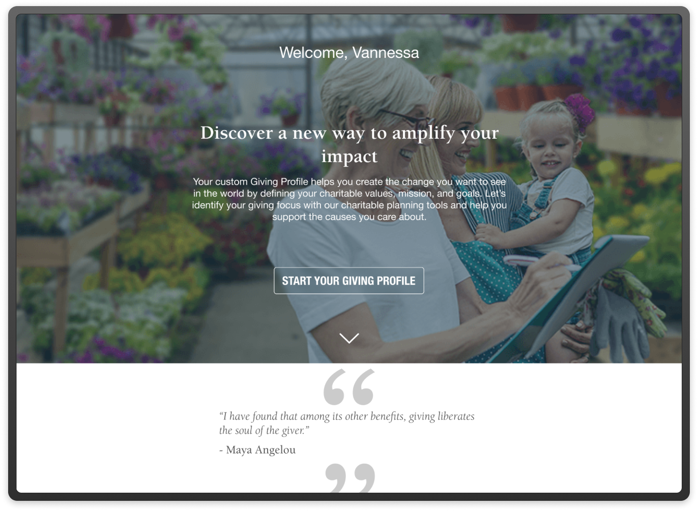
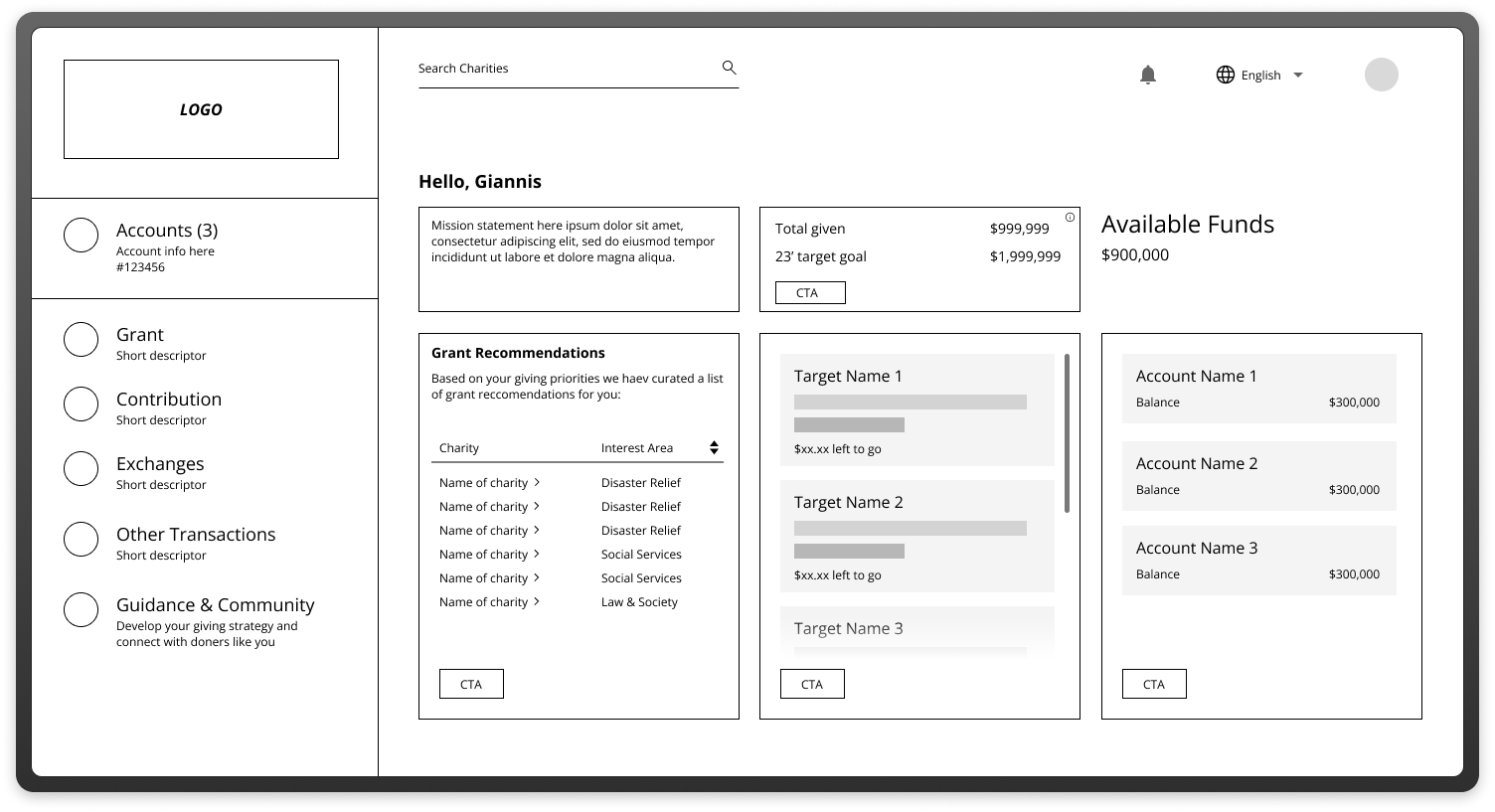
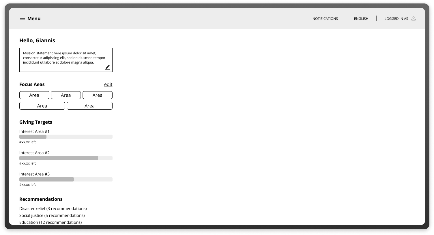
Vanguard Charitable is a nonprofit organization that helps donors support their favorite causes and charities.
The Problem
Vanguard Charitable donors aren't typical users. They're high-net-worth individuals making significant philanthropic decisions — sometimes in coordination with financial advisors, sometimes under time pressure around tax events, always in an environment where trust and security aren't table stakes, they're the entire product.
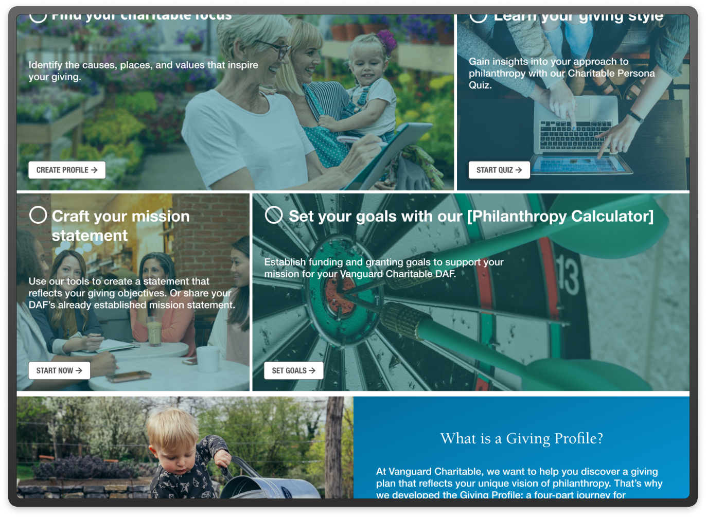
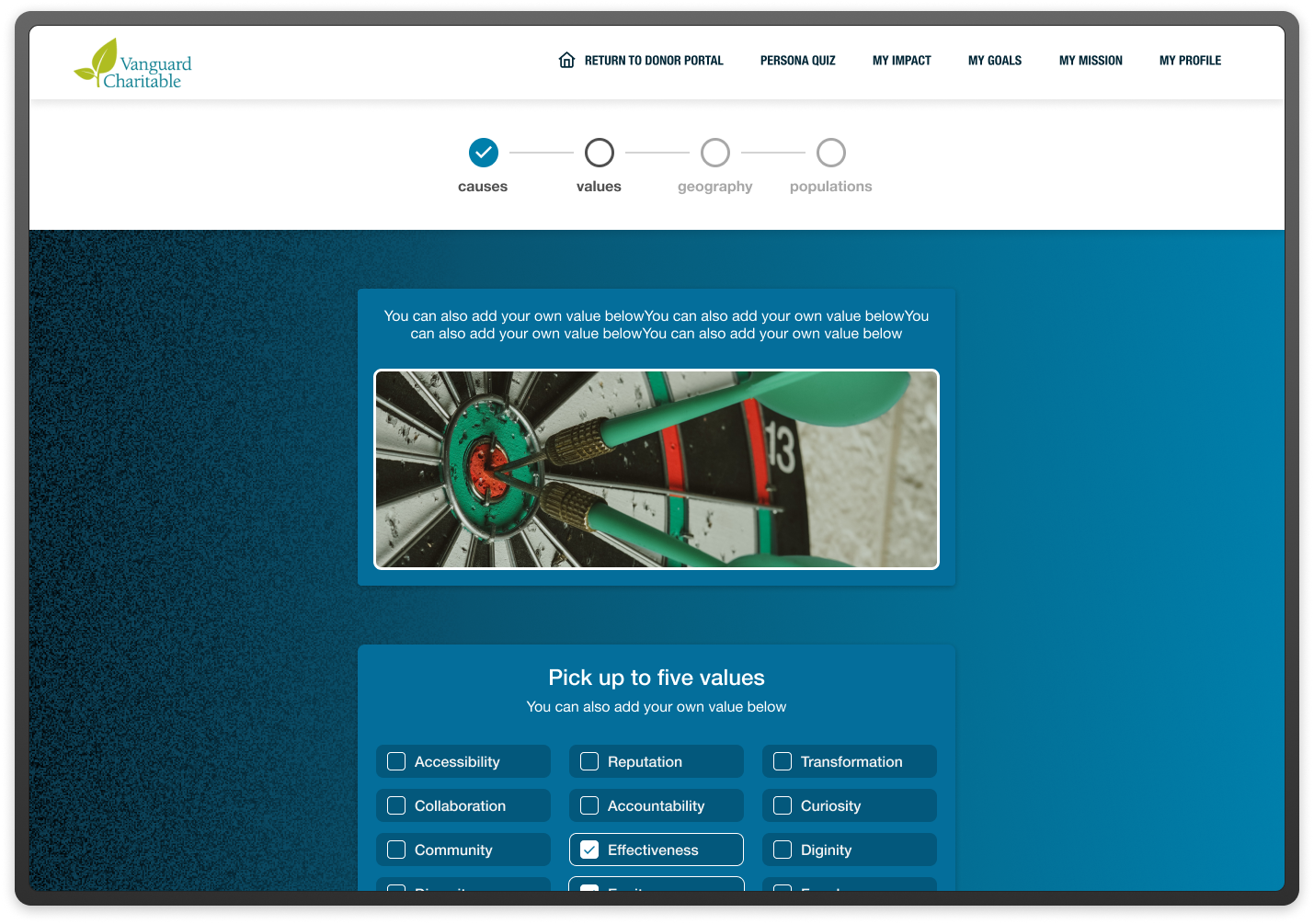
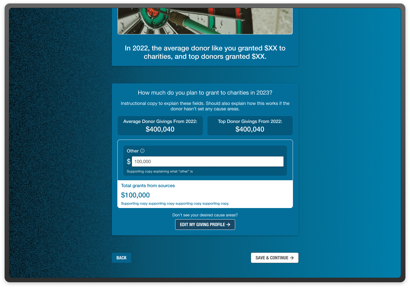
The existing donor portal had functional gaps and a user experience that didn't reflect the seriousness of the decisions being made within it. The brief was to redesign the grant-making experience to be more intuitive, more trustworthy, and better suited to the workflows of sophisticated donors managing giving at scale.
The constraint was significant and non-negotiable: the entire experience had to be built within Salesforce Experience Cloud. This wasn't a greenfield design problem. It was a high-stakes design problem inside a platform with real technical walls.
My Role
I was the lead designer on this project for over six months, working with a cross-functional team of product owners, Salesforce developers, and Vanguard Charitable's internal stakeholders. I owned discovery, interaction design, information architecture, and the ongoing relationship with our research proxies throughout the project.
The Research Constraint - and How We Handled It
The most significant challenge on this project wasn't the platform. It was access. Direct research with Vanguard Charitable's donors wasn't possible during this engagement — understandably, given the profile of the user base and the sensitivity of the financial context.
Instead, we worked with Vanguard's sales team as research proxies. These were people who spoke with donors daily, understood their workflows, knew their frustrations, and could articulate their mental models with precision. They were not donors — and we were explicit with ourselves and with stakeholders about what that meant for our confidence levels.
We used proxy sessions to stress-test structural decisions: navigation, terminology, task flows, and trust signals. We held our confidence in these areas reasonably high, because the sales team's knowledge of donor behavior was deep and operationally grounded. We held visual and tonal decisions more loosely, treating them as informed hypotheses rather than validated conclusions, and documented clearly what would need to be tested with real donors in a future phase.
This calibration — being explicit about what we could and couldn't know — shaped how we wrote our design rationale, how we presented options to stakeholders, and how we scoped the MVP.
Platform Constraints & Design Decisions
Salesforce Experience Cloud is a powerful platform with real design limitations. Custom components are possible but expensive in development time. Layout flexibility is constrained in ways that aren't always obvious until you're deep in implementation.
Early in the project, I mapped the gap between what the ideal donor experience would require and what the platform could deliver without significant custom development. That mapping became a shared artifact with the engineering team — a constraint register that we used to make explicit trade-off decisions rather than discovering limitations mid-build.
Several design directions I explored early didn't survive that process. A dynamic giving history visualization that I'd developed through mid-fidelity prototyping turned out to require custom components that would have consumed a disproportionate share of the development budget. We cut it from the MVP, documented the rationale, and preserved the concept for a future phase.
What we kept was grounded in what Salesforce Experience Cloud could deliver reliably — and we pushed the visual design within those constraints to feel significantly more premium than a default Salesforce implementation, which was important given the donor profile.
Trust as a Design Problem
The biggest design challenge on this project wasn't navigation or information architecture. It was trust.
Donors making grants at significant scale are attuned to signals of security and institutional credibility. Small things — inconsistent typography, ambiguous confirmation states, form flows that felt more consumer than institutional — register as red flags in a way they might not on a lower-stakes platform.
I worked through several iterations on the confirmation and review states of the grant-making flow specifically because these are the moments where donors are most likely to pause and question whether they're in the right place doing the right thing. The final design introduced explicit review steps that might have felt redundant on a different product, but were deliberate here — giving donors visible checkpoints that reinforced confidence in the transaction.
Terminology was also a real design decision. Working with stakeholders and the sales team, we audited every label and microcopy string in the flow for tone — replacing language that felt transactional with language that felt stewardship-oriented. Donors aren't "submitting a form." They're directing a gift.
MVP Scope & What We Deferred
We kept the MVP scope deliberately narrow. Features like advisor co-access — the ability for a financial advisor to initiate or review grants on a donor's behalf — were scoped to a later phase, along with a giving history dashboard and batch grant-making tools for donors with complex multi-recipient strategies.
This wasn't conservatism for its own sake. In a high-trust, high-security context, scope discipline is itself a form of quality. Shipping a grant-making experience that worked reliably and felt trustworthy was more valuable than shipping a feature-complete experience that introduced friction or edge cases in the core flow. We documented the deferred features with the research rationale and development estimates to support the case for phase two funding.
Outcomes
The portal launched. Without direct post-launch data sharing, I can't cite specific adoption or gift volume numbers. What I can say is that a project of this complexity — six months, a constrained platform, a proxy research methodology, high-stakes users — shipped on scope and on schedule, with stakeholder alignment maintained throughout.
The structural decision I'm most confident in is the constraint register approach. Making trade-offs explicit early, in a shared artifact that both design and engineering owned, prevented the kind of late-stage scope conflicts that typically derail projects of this type. That's a process decision I've carried forward.
What I’d Do Differently
I would have pushed harder for even a limited round of research with real donors — even anonymized, even in a controlled setting — before the project closed. The proxy methodology was the right call given the constraints, but the gap between proxy confidence and real-user validation was real, and I was aware of it throughout. Building the case for that access earlier, before the project was underway, would have been worth the effort.
Case Study 1: Constant Contact — Contacts Center Redesign & Custom Fields
Role: Lead Designer, Cross-Functional Team
Company: Constant Contact
Deliverables: Contacts Center Redesign, Custom Fields Feature Set
Constant Contact is a digital marketing platform best known for email marketing, helping businesses create, send, and track email campaigns, while also offering tools for social media, event management, SMS, and lead generation.
The Problem
Constant Contact had a contact management experience that hadn't kept pace with how small business owners actually work. Users were churning or failing to activate core features because the contacts center was fragmented — organizing contacts meaningfully required workarounds, and there was no flexible way to structure data around the specific needs of a given business.
This wasn't a cosmetic problem. A yoga studio, a real estate agent, and a catering company all have different ways of thinking about their contacts. The product treated them the same. The result was a contacts center that felt generic to everyone and truly useful to no one.
The challenge: redesign the contacts center from the ground up and introduce a custom fields feature set — without adding complexity for users who didn't need it.
My Role
I led design for this project within a cross-functional team spanning product management, engineering, and data. I owned the end-to-end design process — from initial discovery and problem framing through interaction design, usability testing, and handoff — while working closely with PMs to align on scope and with engineers to pressure-test feasibility throughout.
Discovery & Framing
Early research revealed two distinct failure modes. The first was activation failure: new users couldn't map their existing contact data into the product's rigid structure, so they'd import a list and then disengage. The second was retention failure: power users who outgrew the default fields had no way to extend the system and were either working around it in spreadsheets or leaving for competitors.
Both problems pointed to the same root cause: the data model was inflexible, and the interface reflected that inflexibility rather than hiding it.
The Design Approach
I approached the redesign in two parallel tracks.
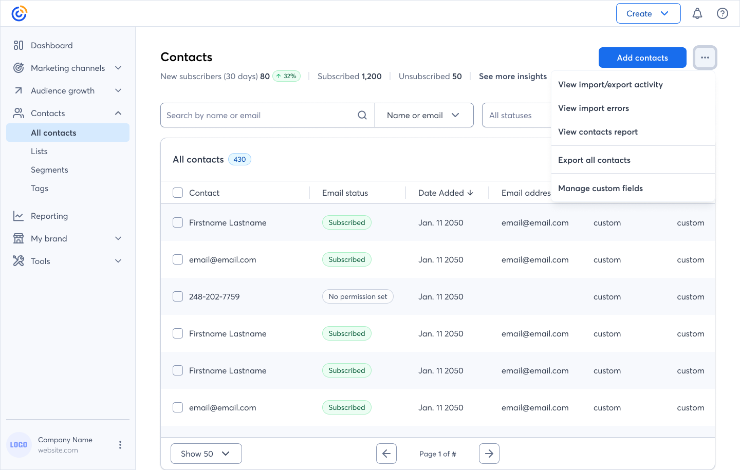
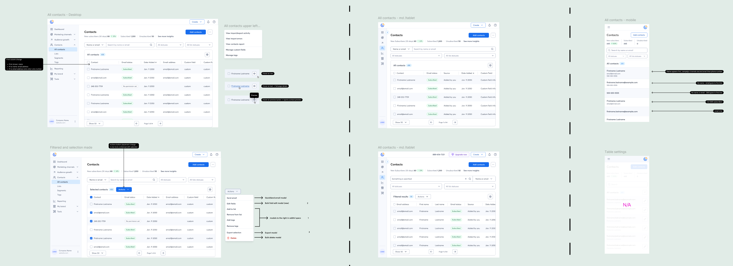
The first was the contacts center itself — simplifying navigation, improving the hierarchy of contact information, and making bulk actions more accessible. This sounds straightforward, but the existing architecture had accumulated years of incremental additions that made the information model genuinely difficult to untangle. I worked closely with engineering to understand what structural changes were feasible within the release timeline, and made deliberate trade-offs about what to defer.
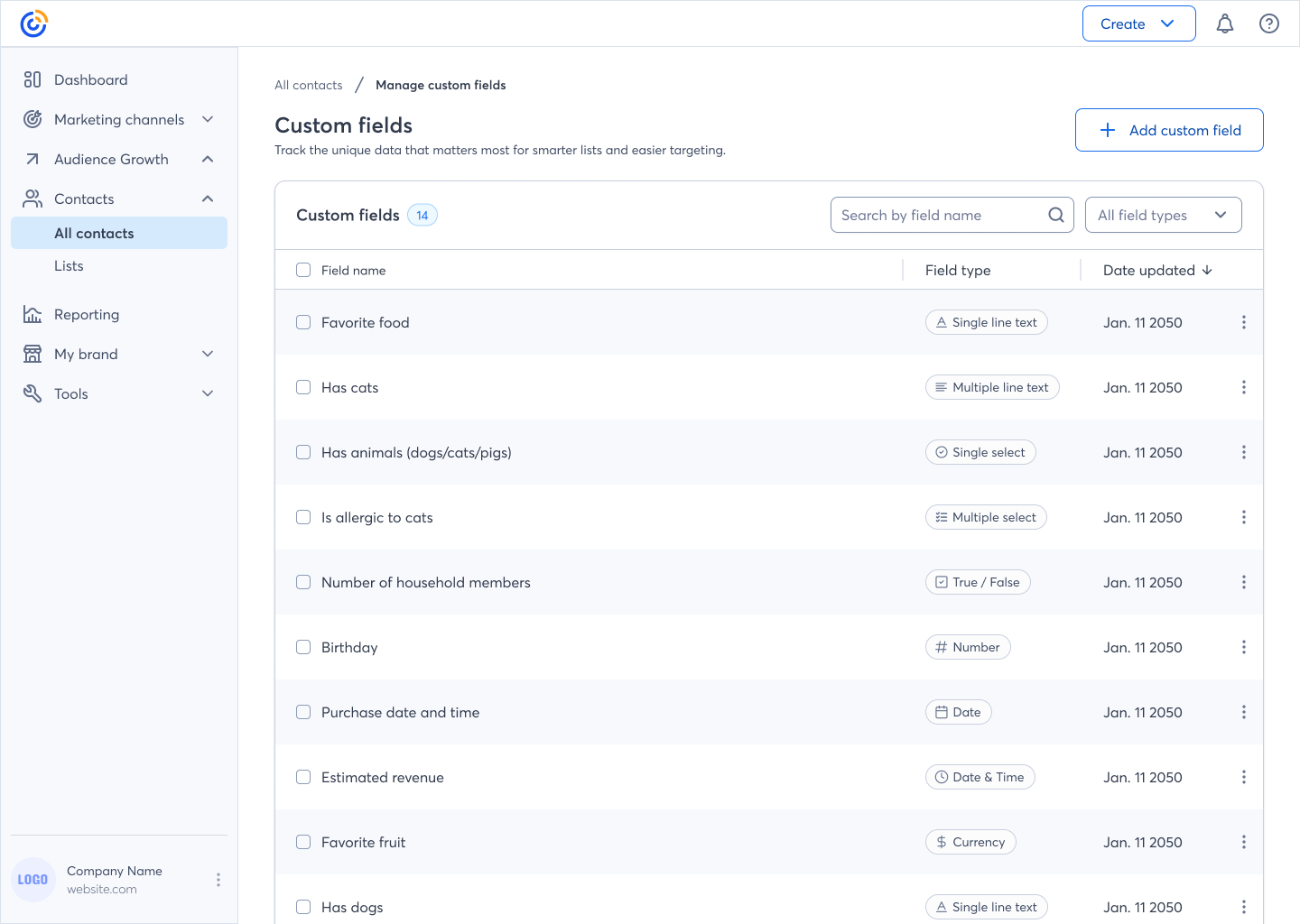
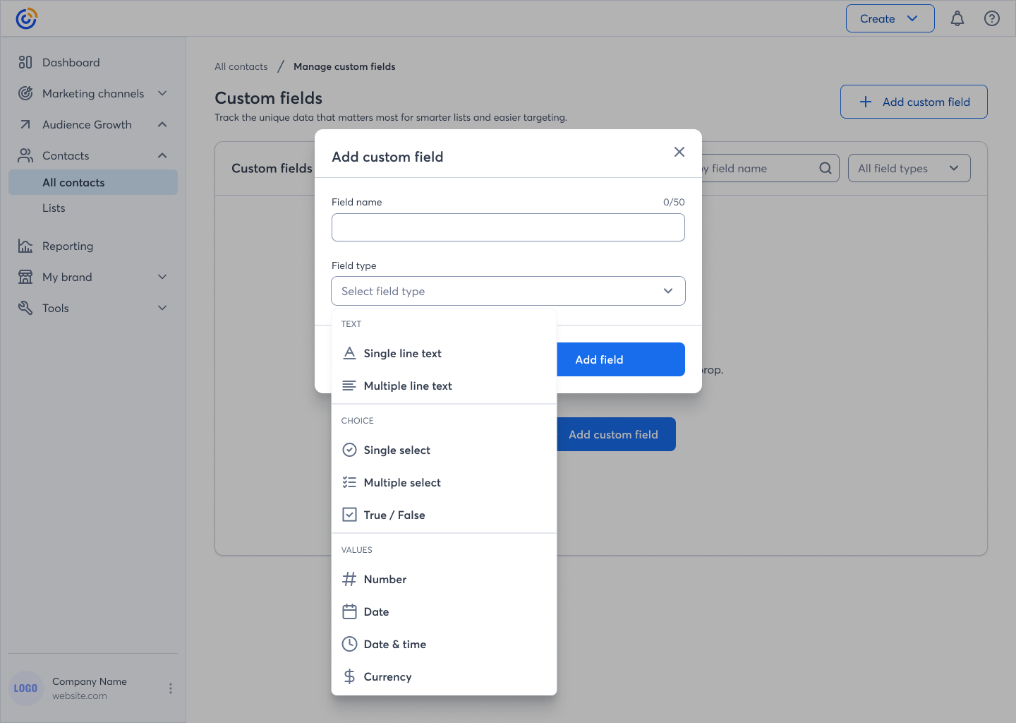
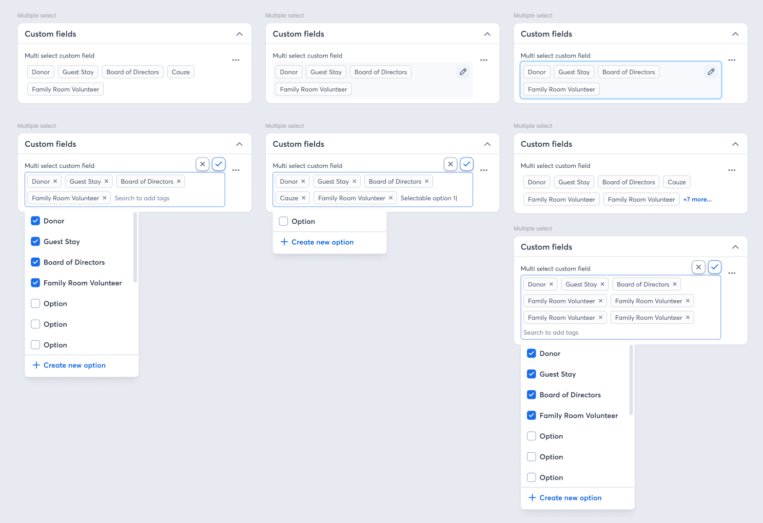
The second track was custom fields. The design challenge here was balancing flexibility with discoverability. If we made custom fields too powerful, they'd be invisible to users who didn't know to look for them. If we surfaced them too prominently, we'd add noise for users who didn't need them. I explored several models before landing on an approach that introduced custom fields contextually — surfaced during the moments users were most likely to feel the limitation of the default structure.
Throughout both tracks, I ran usability testing to pressure-test assumptions. One early assumption that didn't survive testing: we expected users to want to create custom fields upfront, during initial setup. Testing showed they actually wanted to create them in the moment — mid-workflow, when they hit the wall. That finding changed where and how we surfaced the feature entirely.
Trade-off’s & Decisions
Not everything made it into the initial release. We scoped out a templated custom fields library — the idea of giving users pre-built field sets for common business types — because it introduced too much complexity in the creation flow and risked overwhelming users who just wanted one or two additional fields. That feature was documented and handed to the team as a clear next phase, with the research rationale included.
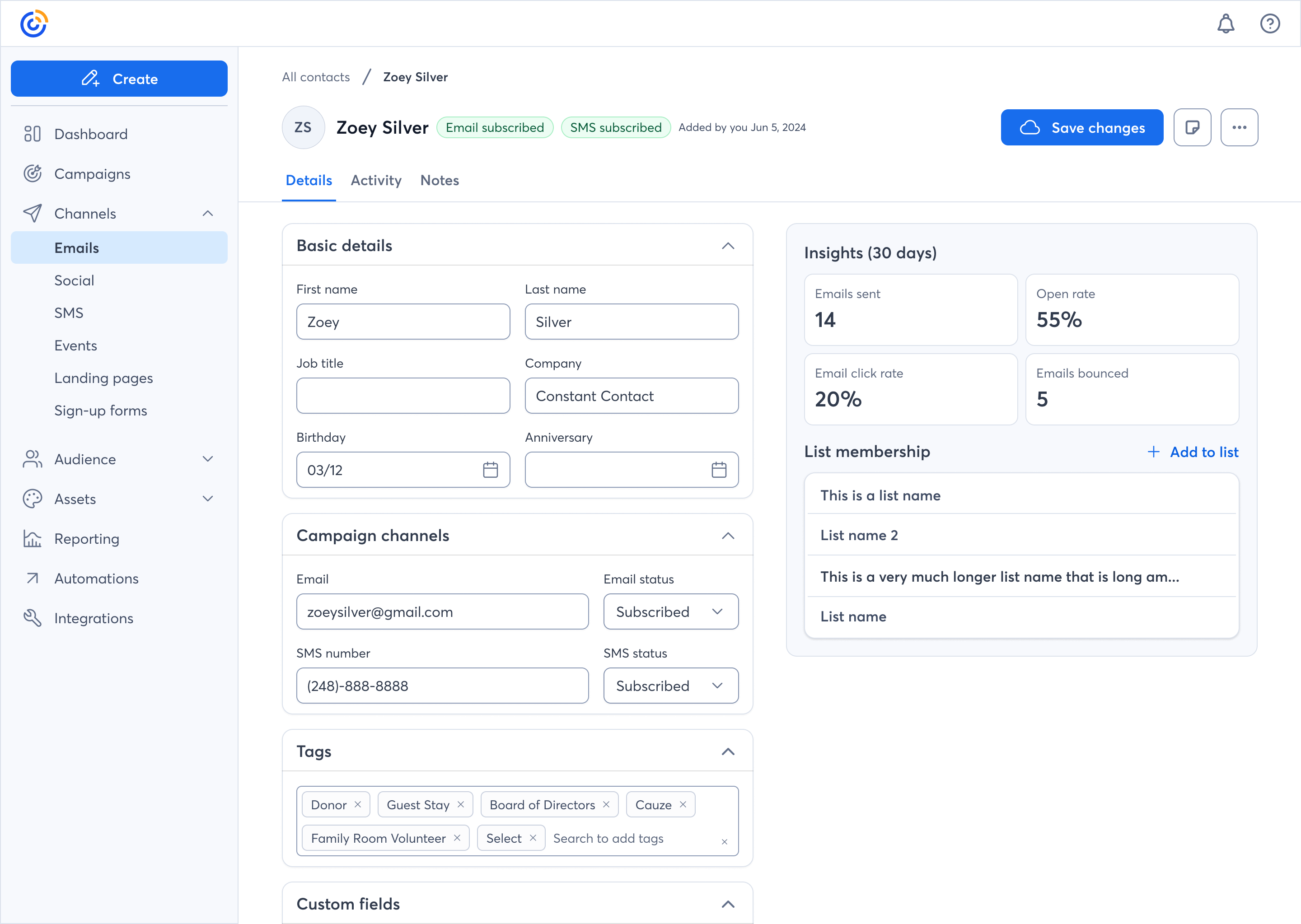
I also pushed back on a request to surface custom fields in the main navigation. The argument was discoverability. My counter-argument was that discoverability through prominent placement would help a small percentage of users while adding visual noise for the majority. We resolved it by adding a contextual entry point within the contact detail view and a single mention in the onboarding checklist — a compromise that kept the interface clean while ensuring new users knew the capability existed.
Outcomes
The redesigned contacts center and custom fields feature shipped to Constant Contact's active user base of approximately 600,000 users.
- Adoption rose 3% — roughly 18,000 users engaging with features they previously weren't
- Retention improved 3% independently — a meaningful reduction in churn at this scale
- At Constant Contact's average subscription value, the combined impact influenced an estimated $4M+ in annual recurring revenue
These weren't outcomes tied to a visual refresh. They were tied directly to making contact management more flexible and more intuitive for users who had been working around the product's limitations for years.
What I’d Do Differently
With more time, I'd have pushed harder for a lightweight feedback loop post-launch — a simple in-product prompt to understand which custom fields users were actually creating. That data would have been valuable for prioritizing the templated fields feature in the next phase and would have given us a cleaner story to tell about how the feature was being used in practice.
Case Study 2: UnitedHealthcare — Rewards Program Redesign
Role: Designer, Cross-Functional Team
Company: UnitedHealthcare (UHC)
Deliverables: Redesigned Rewards Experience, shipped to live users
United Healthcare Rewards is a mobile application that allows users to earn points and redeem rewards for engaging in healthy behaviors. The app aims to motivate users to improve their physical and mental well-being, as well as to increase their loyalty to United Healthcare.
The Problem
UnitedHealthcare's rewards program had an engagement problem that looked simple on the surface and wasn't. Members were enrolling, earning points, and then disengaging — a pattern that showed up in the data as low redemption rates and sporadic return visits. The program existed to change member behavior around preventive health actions. If members weren't coming back and redeeming, the program wasn't working — regardless of how many points were technically being issued.
The business goal was clear: increase sustained engagement and redemption rates among members who had historically interacted with the program sporadically. The design challenge was harder to articulate: how do you make a health incentive program feel immediately relevant and personally motivating to people who are, by nature, only thinking about their health intermittently?
Problem statement: How might we design a rewards app for United Healthcare that encourages users to adopt healthy habits, provides them with meaningful incentives, and enhances their satisfaction with United Healthcare?
My Role
I led design within a cross-functional team alongside product management, engineering, and clinical stakeholders. Health rewards programs operate under specific regulatory and clinical constraints that shaped design decisions throughout — understanding those constraints, and working within them without letting them dictate the experience, was a significant part of the job.
The Design Approach
The redesign touched three core areas.
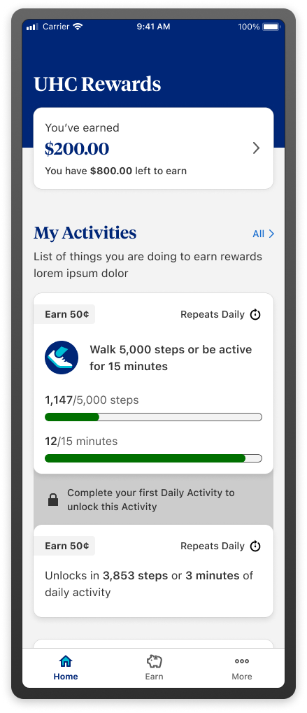
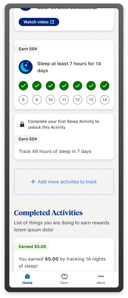
The first was the home experience — the screen members saw when they opened the rewards section. We rebuilt this around the nearest achievable action, not the furthest goal. This sounds like a small change. In terms of interaction design, it required rethinking how we prioritized and sequenced content for members at different stages of engagement.
The second was the redemption flow. Research showed members often didn't know what they could redeem for until they were already deep in the experience. We moved reward options earlier — surfacing them as motivation before members had even earned enough to redeem — so the program felt like it was leading somewhere concrete from the first interaction.
The third was notification and re-engagement. We worked with the product team to align on a notification strategy that was tied to achievable milestones rather than arbitrary time intervals. Members received prompts when they were close to a short-term goal, not just on a weekly cadence.
Trade-off’s & Constraints
Clinical and compliance stakeholders had specific requirements around how health actions could be presented and incentivized. Some of the more direct motivational language we explored in early concepts was flagged as outside clinical guidelines. This was a real constraint, not a bureaucratic one — health incentive programs carry specific regulatory exposure, and the language used to describe health actions matters.
Working within that constraint pushed us toward design solutions that relied more on structure and sequencing than on copy and messaging. In retrospect, that produced a more durable solution — the experience communicated motivation through information architecture rather than marketing language.
Outcomes
The redesign shipped to live users. Targets for the program were set around redemption rate improvement and sustained engagement among previously lapsed members. While I don't have post-launch attribution data to cite directly, the program shipped with instrumentation in place to track both — a meaningful step from the pre-redesign state, where measurement infrastructure had been limited.
The clearest signal I can point to: the redesign was scoped as a one-phase project and extended into a second phase before it launched, based on stakeholder confidence in the direction. In resource-constrained environments, continued investment is its own form of outcome data.
What I’d Do Differently
I'd have pushed earlier for direct access to members who had lapsed. Our discovery research skewed toward currently active members, which gave us good signal about engagement patterns but limited signal about what had caused disengagement in the first place. The insight about progress bars backfiring came late in the process. Earlier access to lapsed users might have surfaced it in discovery rather than in testing.
Case Study 2: UnitedHealthcare — Rewards Program Redesign
Role: Designer (6+ Months)
Company: Vanguard Charitable
Deliverables: Donor-facing grant-making portal, built within Salesforce Experience Cloud
Vanguard Charitable is a nonprofit organization that helps donors support their favorite causes and charities.
The Problem
Vanguard Charitable donors aren't typical users. They're high-net-worth individuals making significant philanthropic decisions — sometimes in coordination with financial advisors, sometimes under time pressure around tax events, always in an environment where trust and security aren't table stakes, they're the entire product.
The existing donor portal had functional gaps and a user experience that didn't reflect the seriousness of the decisions being made within it. The brief was to redesign the grant-making experience to be more intuitive, more trustworthy, and better suited to the workflows of sophisticated donors managing giving at scale.
The constraint was significant and non-negotiable: the entire experience had to be built within Salesforce Experience Cloud. This wasn't a greenfield design problem. It was a high-stakes design problem inside a platform with real technical walls.
My Role
I was the lead designer on this project for over six months, working with a cross-functional team of product owners, Salesforce developers, and Vanguard Charitable's internal stakeholders. I owned discovery, interaction design, information architecture, and the ongoing relationship with our research proxies throughout the project.
The Research Constraint - and How We Handled It
The most significant challenge on this project wasn't the platform. It was access. Direct research with Vanguard Charitable's donors wasn't possible during this engagement — understandably, given the profile of the user base and the sensitivity of the financial context.
Instead, we worked with Vanguard's sales team as research proxies. These were people who spoke with donors daily, understood their workflows, knew their frustrations, and could articulate their mental models with precision. They were not donors — and we were explicit with ourselves and with stakeholders about what that meant for our confidence levels.
We used proxy sessions to stress-test structural decisions: navigation, terminology, task flows, and trust signals. We held our confidence in these areas reasonably high, because the sales team's knowledge of donor behavior was deep and operationally grounded. We held visual and tonal decisions more loosely, treating them as informed hypotheses rather than validated conclusions, and documented clearly what would need to be tested with real donors in a future phase.
This calibration — being explicit about what we could and couldn't know — shaped how we wrote our design rationale, how we presented options to stakeholders, and how we scoped the MVP.
Platform Constraints & Design Decisions
Salesforce Experience Cloud is a powerful platform with real design limitations. Custom components are possible but expensive in development time. Layout flexibility is constrained in ways that aren't always obvious until you're deep in implementation.
Early in the project, I mapped the gap between what the ideal donor experience would require and what the platform could deliver without significant custom development. That mapping became a shared artifact with the engineering team — a constraint register that we used to make explicit trade-off decisions rather than discovering limitations mid-build.
Several design directions I explored early didn't survive that process. A dynamic giving history visualization that I'd developed through mid-fidelity prototyping turned out to require custom components that would have consumed a disproportionate share of the development budget. We cut it from the MVP, documented the rationale, and preserved the concept for a future phase.
What we kept was grounded in what Salesforce Experience Cloud could deliver reliably — and we pushed the visual design within those constraints to feel significantly more premium than a default Salesforce implementation, which was important given the donor profile.
Trust as a Design Problem
The biggest design challenge on this project wasn't navigation or information architecture. It was trust.
Donors making grants at significant scale are attuned to signals of security and institutional credibility. Small things — inconsistent typography, ambiguous confirmation states, form flows that felt more consumer than institutional — register as red flags in a way they might not on a lower-stakes platform.
I worked through several iterations on the confirmation and review states of the grant-making flow specifically because these are the moments where donors are most likely to pause and question whether they're in the right place doing the right thing. The final design introduced explicit review steps that might have felt redundant on a different product, but were deliberate here — giving donors visible checkpoints that reinforced confidence in the transaction.
Terminology was also a real design decision. Working with stakeholders and the sales team, we audited every label and microcopy string in the flow for tone — replacing language that felt transactional with language that felt stewardship-oriented. Donors aren't "submitting a form." They're directing a gift.
MVP Scope & What We Deferred
We kept the MVP scope deliberately narrow. Features like advisor co-access — the ability for a financial advisor to initiate or review grants on a donor's behalf — were scoped to a later phase, along with a giving history dashboard and batch grant-making tools for donors with complex multi-recipient strategies.
This wasn't conservatism for its own sake. In a high-trust, high-security context, scope discipline is itself a form of quality. Shipping a grant-making experience that worked reliably and felt trustworthy was more valuable than shipping a feature-complete experience that introduced friction or edge cases in the core flow. We documented the deferred features with the research rationale and development estimates to support the case for phase two funding.
Outcomes
The portal launched. Without direct post-launch data sharing, I can't cite specific adoption or gift volume numbers. What I can say is that a project of this complexity — six months, a constrained platform, a proxy research methodology, high-stakes users — shipped on scope and on schedule, with stakeholder alignment maintained throughout.
The structural decision I'm most confident in is the constraint register approach. Making trade-offs explicit early, in a shared artifact that both design and engineering owned, prevented the kind of late-stage scope conflicts that typically derail projects of this type. That's a process decision I've carried forward.
What I’d Do Differently
I would have pushed harder for even a limited round of research with real donors — even anonymized, even in a controlled setting — before the project closed. The proxy methodology was the right call given the constraints, but the gap between proxy confidence and real-user validation was real, and I was aware of it throughout. Building the case for that access earlier, before the project was underway, would have been worth the effort.
Case Study 1: Constant Contact — Contacts Center Redesign & Custom Fields
Role: Lead Designer, Cross-Functional Team
Company: Constant Contact
Deliverables: Contacts Center Redesign, Custom Fields Feature Set
Constant Contact is a digital marketing platform best known for email marketing, helping businesses create, send, and track email campaigns, while also offering tools for social media, event management, SMS, and lead generation.
The Problem
Constant Contact had a contact management experience that hadn't kept pace with how small business owners actually work. Users were churning or failing to activate core features because the contacts center was fragmented — organizing contacts meaningfully required workarounds, and there was no flexible way to structure data around the specific needs of a given business.
This wasn't a cosmetic problem. A yoga studio, a real estate agent, and a catering company all have different ways of thinking about their contacts. The product treated them the same. The result was a contacts center that felt generic to everyone and truly useful to no one.
The challenge: redesign the contacts center from the ground up and introduce a custom fields feature set — without adding complexity for users who didn't need it.

My Role
I led design for this project within a cross-functional team spanning product management, engineering, and data. I owned the end-to-end design process — from initial discovery and problem framing through interaction design, usability testing, and handoff — while working closely with PMs to align on scope and with engineers to pressure-test feasibility throughout.
Discovery & Framing
Early research revealed two distinct failure modes. The first was activation failure: new users couldn't map their existing contact data into the product's rigid structure, so they'd import a list and then disengage. The second was retention failure: power users who outgrew the default fields had no way to extend the system and were either working around it in spreadsheets or leaving for competitors.
Both problems pointed to the same root cause: the data model was inflexible, and the interface reflected that inflexibility rather than hiding it.
The Design Approach
I approached the redesign in two parallel tracks.
The first was the contacts center itself — simplifying navigation, improving the hierarchy of contact information, and making bulk actions more accessible. This sounds straightforward, but the existing architecture had accumulated years of incremental additions that made the information model genuinely difficult to untangle. I worked closely with engineering to understand what structural changes were feasible within the release timeline, and made deliberate trade-offs about what to defer.
The second track was custom fields. The design challenge here was balancing flexibility with discoverability. If we made custom fields too powerful, they'd be invisible to users who didn't know to look for them. If we surfaced them too prominently, we'd add noise for users who didn't need them. I explored several models before landing on an approach that introduced custom fields contextually — surfaced during the moments users were most likely to feel the limitation of the default structure.
Throughout both tracks, I ran usability testing to pressure-test assumptions. One early assumption that didn't survive testing: we expected users to want to create custom fields upfront, during initial setup. Testing showed they actually wanted to create them in the moment — mid-workflow, when they hit the wall. That finding changed where and how we surfaced the feature entirely.
Trade-off’s & Decisions
Not everything made it into the initial release. We scoped out a templated custom fields library — the idea of giving users pre-built field sets for common business types — because it introduced too much complexity in the creation flow and risked overwhelming users who just wanted one or two additional fields. That feature was documented and handed to the team as a clear next phase, with the research rationale included.
I also pushed back on a request to surface custom fields in the main navigation. The argument was discoverability. My counter-argument was that discoverability through prominent placement would help a small percentage of users while adding visual noise for the majority. We resolved it by adding a contextual entry point within the contact detail view and a single mention in the onboarding checklist — a compromise that kept the interface clean while ensuring new users knew the capability existed.
Outcomes
The redesigned contacts center and custom fields feature shipped to Constant Contact's active user base of approximately 600,000 users.
- Adoption rose 3% — roughly 18,000 users engaging with features they previously weren't
- Retention improved 3% independently — a meaningful reduction in churn at this scale
- At Constant Contact's average subscription value, the combined impact influenced an estimated $4M+ in annual recurring revenue
These weren't outcomes tied to a visual refresh. They were tied directly to making contact management more flexible and more intuitive for users who had been working around the product's limitations for years.
What I’d Do Differently
With more time, I'd have pushed harder for a lightweight feedback loop post-launch — a simple in-product prompt to understand which custom fields users were actually creating. That data would have been valuable for prioritizing the templated fields feature in the next phase and would have given us a cleaner story to tell about how the feature was being used in practice.
Case Study 2: UnitedHealthcare — Rewards Program Redesign
Role: Designer, Cross-Functional Team
Company: UnitedHealthcare (UHC)
Deliverables: Redesigned Rewards Experience, shipped to live users
United Healthcare Rewards is a mobile application that allows users to earn points and redeem rewards for engaging in healthy behaviors. The app aims to motivate users to improve their physical and mental well-being, as well as to increase their loyalty to United Healthcare.
Problem statement: How might we design a rewards app for United Healthcare that encourages users to adopt healthy habits, provides them with meaningful incentives, and enhances their satisfaction with United Healthcare?
The Problem
UnitedHealthcare's rewards program had an engagement problem that looked simple on the surface and wasn't. Members were enrolling, earning points, and then disengaging — a pattern that showed up in the data as low redemption rates and sporadic return visits. The program existed to change member behavior around preventive health actions. If members weren't coming back and redeeming, the program wasn't working — regardless of how many points were technically being issued.
The business goal was clear: increase sustained engagement and redemption rates among members who had historically interacted with the program sporadically. The design challenge was harder to articulate: how do you make a health incentive program feel immediately relevant and personally motivating to people who are, by nature, only thinking about their health intermittently?
My Role
I led design within a cross-functional team alongside product management, engineering, and clinical stakeholders. Health rewards programs operate under specific regulatory and clinical constraints that shaped design decisions throughout — understanding those constraints, and working within them without letting them dictate the experience, was a significant part of the job.
The Design Approach
The redesign touched three core areas.
The first was the home experience — the screen members saw when they opened the rewards section. We rebuilt this around the nearest achievable action, not the furthest goal. This sounds like a small change. In terms of interaction design, it required rethinking how we prioritized and sequenced content for members at different stages of engagement.
The second was the redemption flow. Research showed members often didn't know what they could redeem for until they were already deep in the experience. We moved reward options earlier — surfacing them as motivation before members had even earned enough to redeem — so the program felt like it was leading somewhere concrete from the first interaction.
The third was notification and re-engagement. We worked with the product team to align on a notification strategy that was tied to achievable milestones rather than arbitrary time intervals. Members received prompts when they were close to a short-term goal, not just on a weekly cadence.
Trade-off’s & Constraints
Clinical and compliance stakeholders had specific requirements around how health actions could be presented and incentivized. Some of the more direct motivational language we explored in early concepts was flagged as outside clinical guidelines. This was a real constraint, not a bureaucratic one — health incentive programs carry specific regulatory exposure, and the language used to describe health actions matters.
Working within that constraint pushed us toward design solutions that relied more on structure and sequencing than on copy and messaging. In retrospect, that produced a more durable solution — the experience communicated motivation through information architecture rather than marketing language.
Outcomes
The redesign shipped to live users. Targets for the program were set around redemption rate improvement and sustained engagement among previously lapsed members. While I don't have post-launch attribution data to cite directly, the program shipped with instrumentation in place to track both — a meaningful step from the pre-redesign state, where measurement infrastructure had been limited.
The clearest signal I can point to: the redesign was scoped as a one-phase project and extended into a second phase before it launched, based on stakeholder confidence in the direction. In resource-constrained environments, continued investment is its own form of outcome data.
What I’d Do Differently
I'd have pushed earlier for direct access to members who had lapsed. Our discovery research skewed toward currently active members, which gave us good signal about engagement patterns but limited signal about what had caused disengagement in the first place. The insight about progress bars backfiring came late in the process. Earlier access to lapsed users might have surfaced it in discovery rather than in testing.
Case Study 2: UnitedHealthcare — Rewards Program Redesign
Role: Designer (6+ Months)
Company: Vanguard Charitable
Deliverables: Donor-facing grant-making portal, built within Salesforce Experience Cloud
Vanguard Charitable is a nonprofit organization that helps donors support their favorite causes and charities.
The Problem
Vanguard Charitable donors aren't typical users. They're high-net-worth individuals making significant philanthropic decisions — sometimes in coordination with financial advisors, sometimes under time pressure around tax events, always in an environment where trust and security aren't table stakes, they're the entire product.
The existing donor portal had functional gaps and a user experience that didn't reflect the seriousness of the decisions being made within it. The brief was to redesign the grant-making experience to be more intuitive, more trustworthy, and better suited to the workflows of sophisticated donors managing giving at scale.
The constraint was significant and non-negotiable: the entire experience had to be built within Salesforce Experience Cloud. This wasn't a greenfield design problem. It was a high-stakes design problem inside a platform with real technical walls.
My Role
I was the lead designer on this project for over six months, working with a cross-functional team of product owners, Salesforce developers, and Vanguard Charitable's internal stakeholders. I owned discovery, interaction design, information architecture, and the ongoing relationship with our research proxies throughout the project.
The Research Constraint - and How We Handled It
The most significant challenge on this project wasn't the platform. It was access. Direct research with Vanguard Charitable's donors wasn't possible during this engagement — understandably, given the profile of the user base and the sensitivity of the financial context.
Instead, we worked with Vanguard's sales team as research proxies. These were people who spoke with donors daily, understood their workflows, knew their frustrations, and could articulate their mental models with precision. They were not donors — and we were explicit with ourselves and with stakeholders about what that meant for our confidence levels.
We used proxy sessions to stress-test structural decisions: navigation, terminology, task flows, and trust signals. We held our confidence in these areas reasonably high, because the sales team's knowledge of donor behavior was deep and operationally grounded. We held visual and tonal decisions more loosely, treating them as informed hypotheses rather than validated conclusions, and documented clearly what would need to be tested with real donors in a future phase.
This calibration — being explicit about what we could and couldn't know — shaped how we wrote our design rationale, how we presented options to stakeholders, and how we scoped the MVP.
Platform Constraints & Design Decisions
Salesforce Experience Cloud is a powerful platform with real design limitations. Custom components are possible but expensive in development time. Layout flexibility is constrained in ways that aren't always obvious until you're deep in implementation.
Early in the project, I mapped the gap between what the ideal donor experience would require and what the platform could deliver without significant custom development. That mapping became a shared artifact with the engineering team — a constraint register that we used to make explicit trade-off decisions rather than discovering limitations mid-build.
Several design directions I explored early didn't survive that process. A dynamic giving history visualization that I'd developed through mid-fidelity prototyping turned out to require custom components that would have consumed a disproportionate share of the development budget. We cut it from the MVP, documented the rationale, and preserved the concept for a future phase.
What we kept was grounded in what Salesforce Experience Cloud could deliver reliably — and we pushed the visual design within those constraints to feel significantly more premium than a default Salesforce implementation, which was important given the donor profile.
Trust as a Design Problem
The biggest design challenge on this project wasn't navigation or information architecture. It was trust.
Donors making grants at significant scale are attuned to signals of security and institutional credibility. Small things — inconsistent typography, ambiguous confirmation states, form flows that felt more consumer than institutional — register as red flags in a way they might not on a lower-stakes platform.
I worked through several iterations on the confirmation and review states of the grant-making flow specifically because these are the moments where donors are most likely to pause and question whether they're in the right place doing the right thing. The final design introduced explicit review steps that might have felt redundant on a different product, but were deliberate here — giving donors visible checkpoints that reinforced confidence in the transaction.
Terminology was also a real design decision. Working with stakeholders and the sales team, we audited every label and microcopy string in the flow for tone — replacing language that felt transactional with language that felt stewardship-oriented. Donors aren't "submitting a form." They're directing a gift.
MVP Scope & What We Deferred
We kept the MVP scope deliberately narrow. Features like advisor co-access — the ability for a financial advisor to initiate or review grants on a donor's behalf — were scoped to a later phase, along with a giving history dashboard and batch grant-making tools for donors with complex multi-recipient strategies.
This wasn't conservatism for its own sake. In a high-trust, high-security context, scope discipline is itself a form of quality. Shipping a grant-making experience that worked reliably and felt trustworthy was more valuable than shipping a feature-complete experience that introduced friction or edge cases in the core flow. We documented the deferred features with the research rationale and development estimates to support the case for phase two funding.
Outcomes
The portal launched. Without direct post-launch data sharing, I can't cite specific adoption or gift volume numbers. What I can say is that a project of this complexity — six months, a constrained platform, a proxy research methodology, high-stakes users — shipped on scope and on schedule, with stakeholder alignment maintained throughout.
The structural decision I'm most confident in is the constraint register approach. Making trade-offs explicit early, in a shared artifact that both design and engineering owned, prevented the kind of late-stage scope conflicts that typically derail projects of this type. That's a process decision I've carried forward.
What I’d Do Differently
I would have pushed harder for even a limited round of research with real donors — even anonymized, even in a controlled setting — before the project closed. The proxy methodology was the right call given the constraints, but the gap between proxy confidence and real-user validation was real, and I was aware of it throughout. Building the case for that access earlier, before the project was underway, would have been worth the effort.